
How do you brand for something that is more philosophy than product?
For a platform that is more about is contributors than itself?
The idea is simple: create a visual feeling that suggests at identity rather than firmly creating a box within which to fit everything.
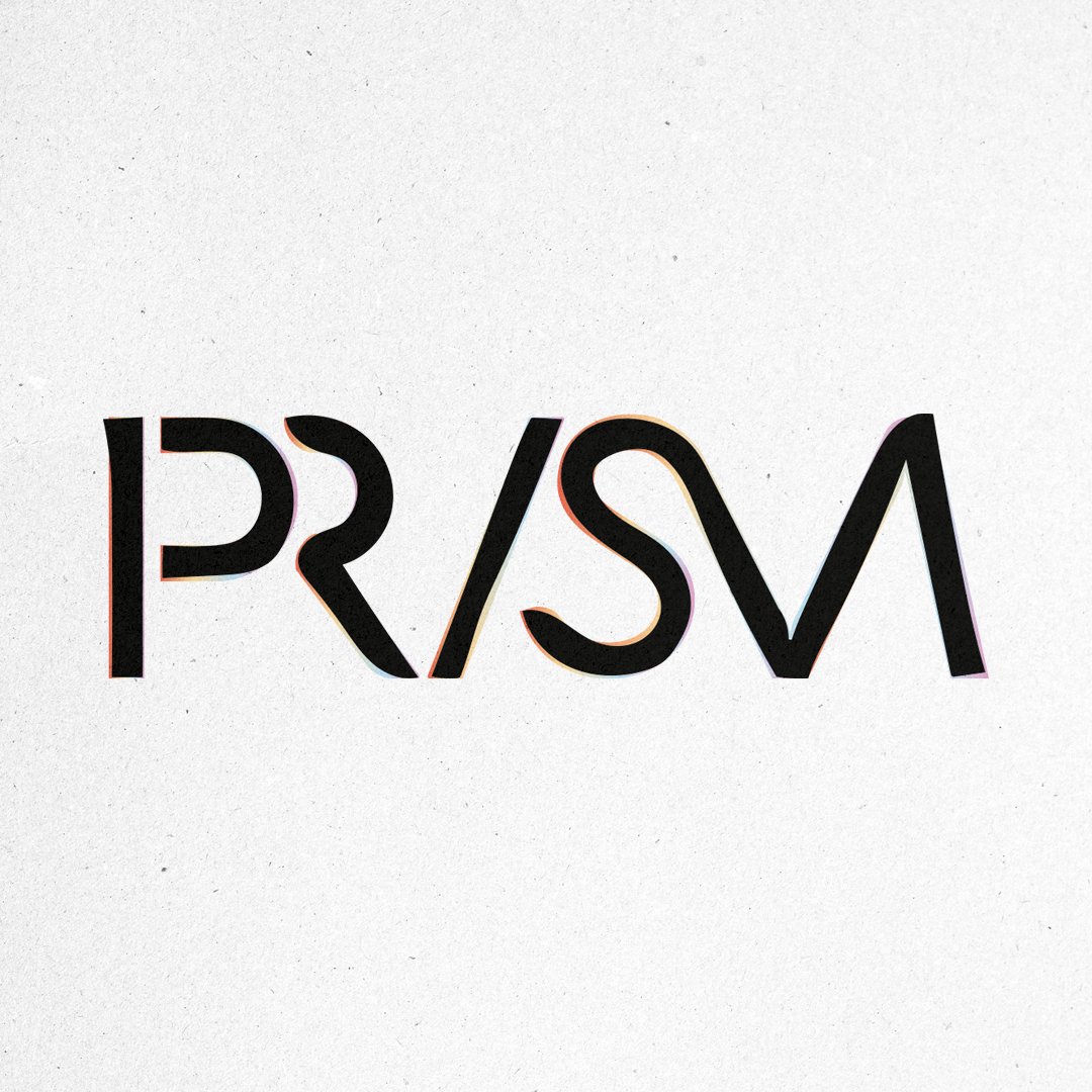
That's what we faced and how we repsonded to Prism, a collective, a creative platform to share ideas, tell stories, seek response and build community through collaboration and artistic interpretation.
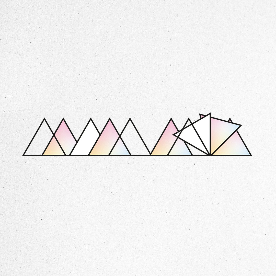
What Staff created is a suite of elements that are in parts reflective and suggestive, playful and framing, and intended to create a visual overture rather than define a solid set of brand rules and borders that allows the various contributions to exist by themselves without having other ideas projected or being stylistically compromised, whilst still having a system that can hold these things together to create some semblance of narrative, much like the way an Art Gallery has its flavour but allows the art to be seen in its own right.
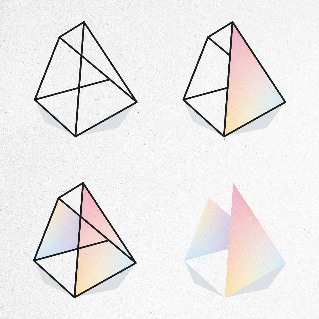
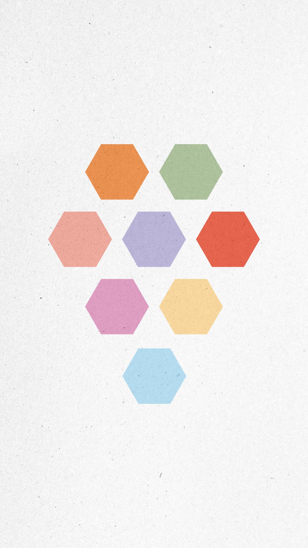
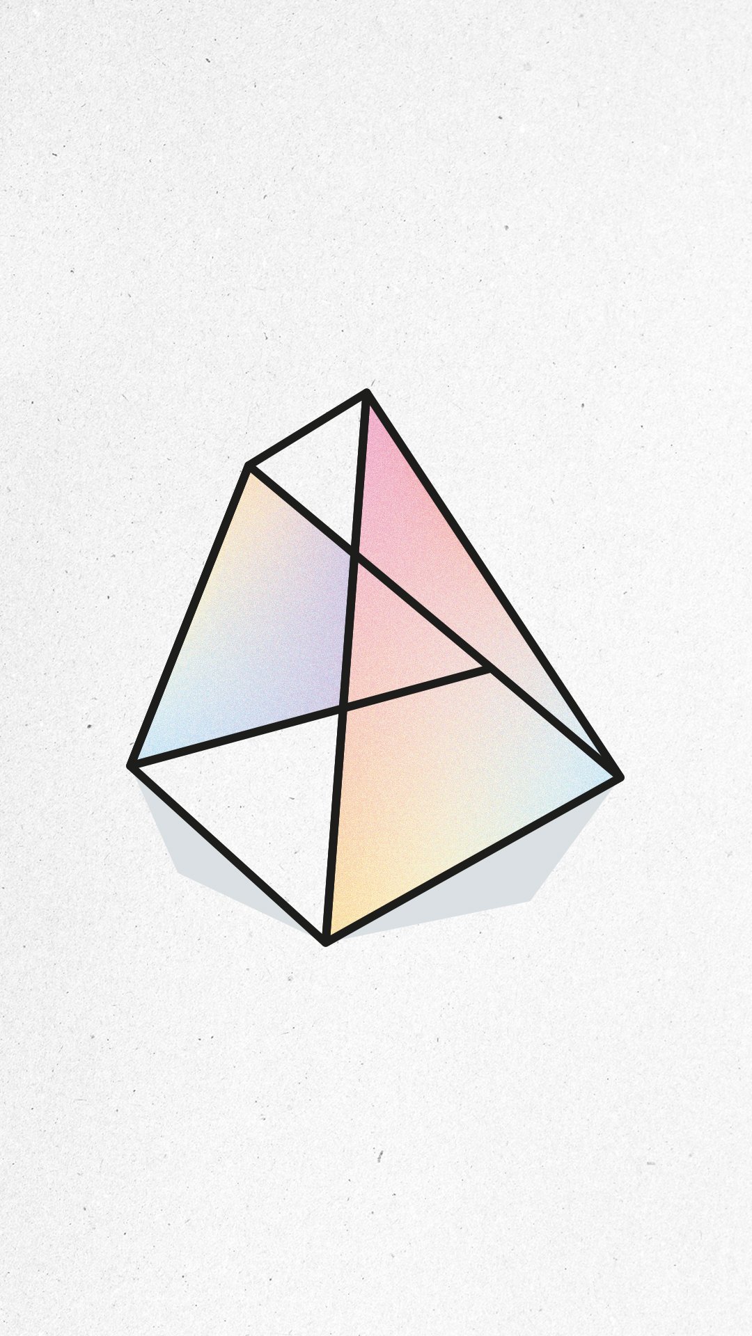
In a nice twist the more time we spent abstracting and refracting the idea of the 'Prism' concept, the more it lent itself to a playful nod too and abstraction of a literal solution. So, we played much more with the
colours and the reactions of light through a prism than a solid representation of one to create the pliable, colur and shape idea taking us much more in line with the concept behind the name - 'just as a prism refracts
the whole spectrum, so too does Prism Co. reflect the richness of the Creator's work in the world around us, spreading beauty and sparking curiosity'.
It's nice to flex once in a while and run with a firm concept that has few parameters.