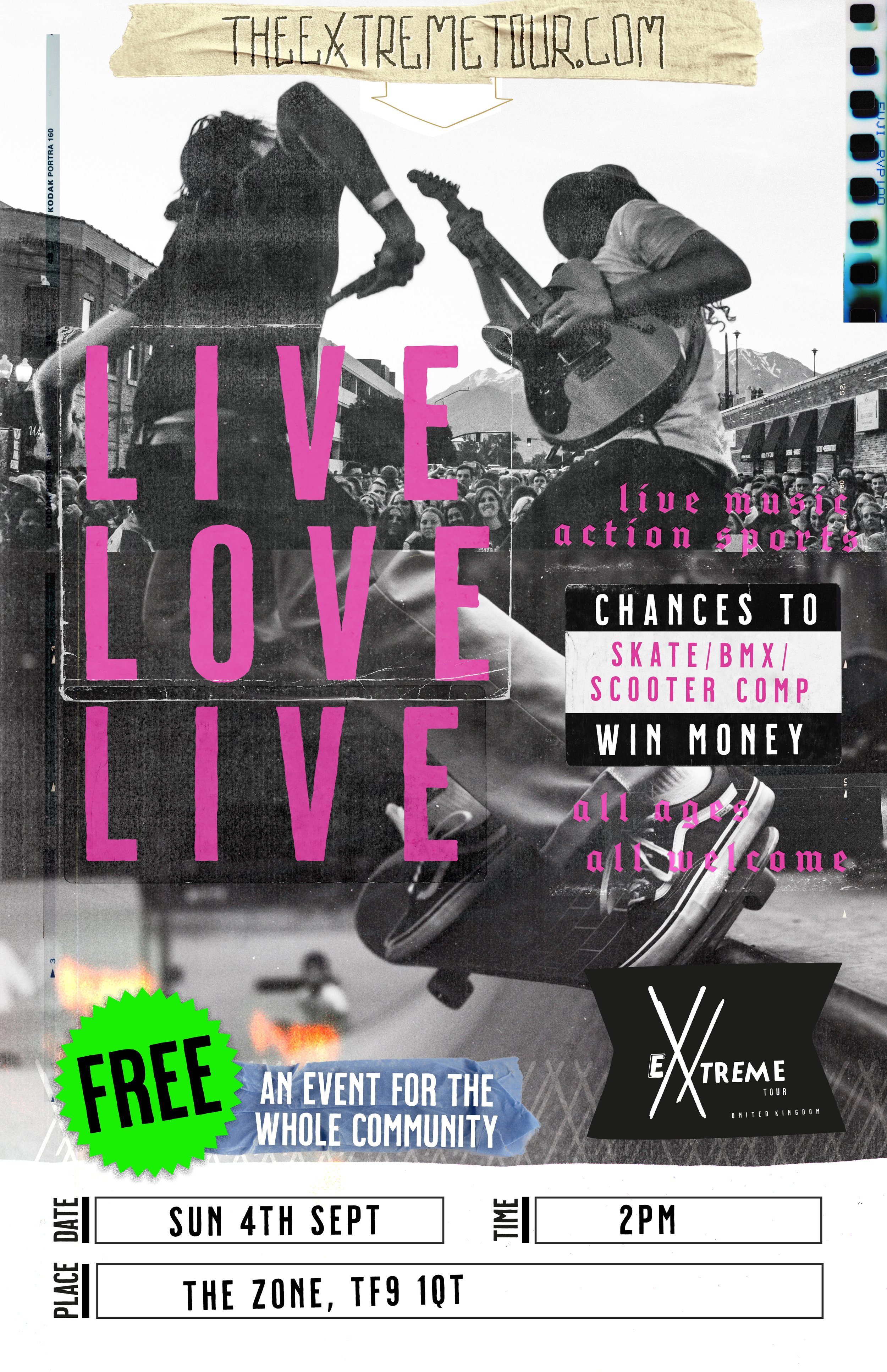
A huge part of what we do is aim to give back through our creativity and services, so it’s an honour for us to give to @theextremetourofficial who use music, creative arts and sports to reach out to kids who are lost or marginalised and help them find somewhere they are welcomed and loved.
Our brand for @extremeuk_official is not about just creating a visual identity but finding the things that represent everything about where this organisation has come from, those who serve as part of it and what it means at it very core.
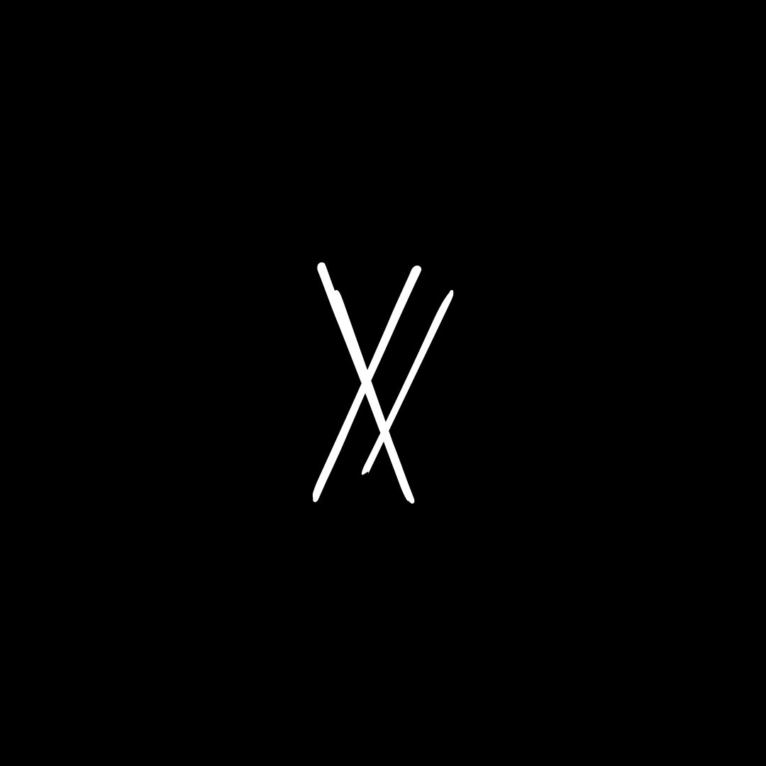
i. ExUK Chi Rho.
Symbolic of our very movement, the Ex-Chi-Rho stands for every scar we have endured, every story we stand with. It is for the stripes taken on our behalf.
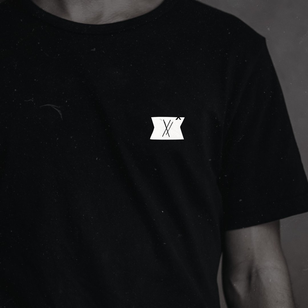
ii. ExUK Tag image.
We are all paid in full, the Extreme UK Tag represents the voucher that is written for each and every one of us.
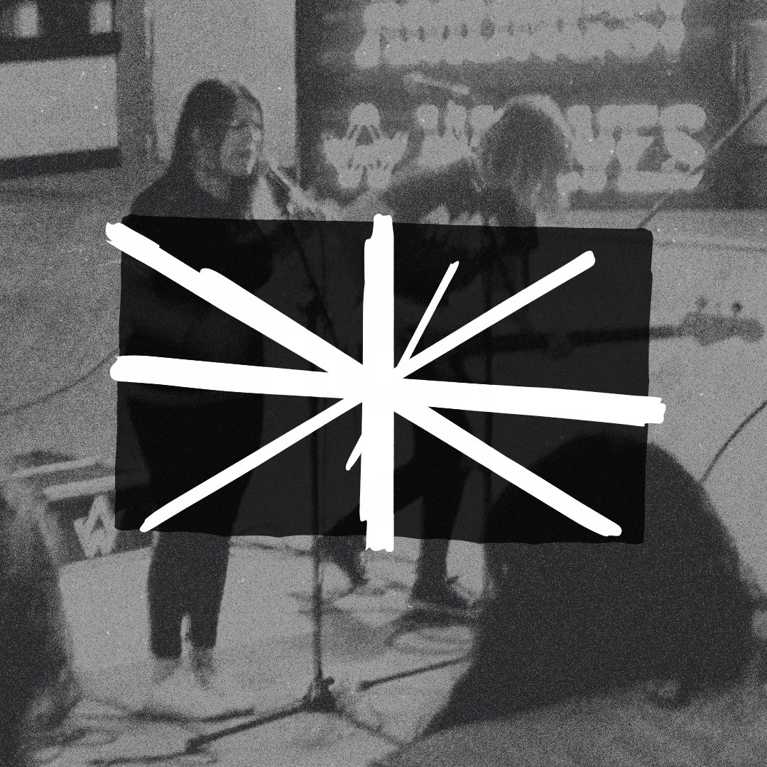
iii. ExUK Flag.
We fly this flag - not as a symbol of nationalism, but as an identifier in the world, a beacon to point the way. This is something under which to gather and recognise the scars worn by our nation, a reminder that we have gone through momentous things that we will carry and work to heal together.