A commission from a new organisation based in the US but working worldwide to help media organisations with communications, marketing and fundraising.
Here's a bit of inside process, the initial meetings started at the earliest possible stage - without even a name! And our involvement stretches from naming and brand development to marketing and content strategy as well as lending our expertise to the mix of resources offered by the newly named Coach Brock & Company.
As you scroll these images you can see some of the stages of note taking; keywords and phrases, values listing and deliverables to be considered. Throughout the notes you might spot the initial words and doodles which during conversations became key elements in the brand development.
As the delivery of the service operates in a not dissimilar way to sports coaching, the metaphor was a strong starting point and key reference for the brand development, with the headset graphic mark being a nice addition and also lending something of an abstract for the letter C that could be utilised for responsive needs.
Excited to be part of this one and the good work it puts a face to!
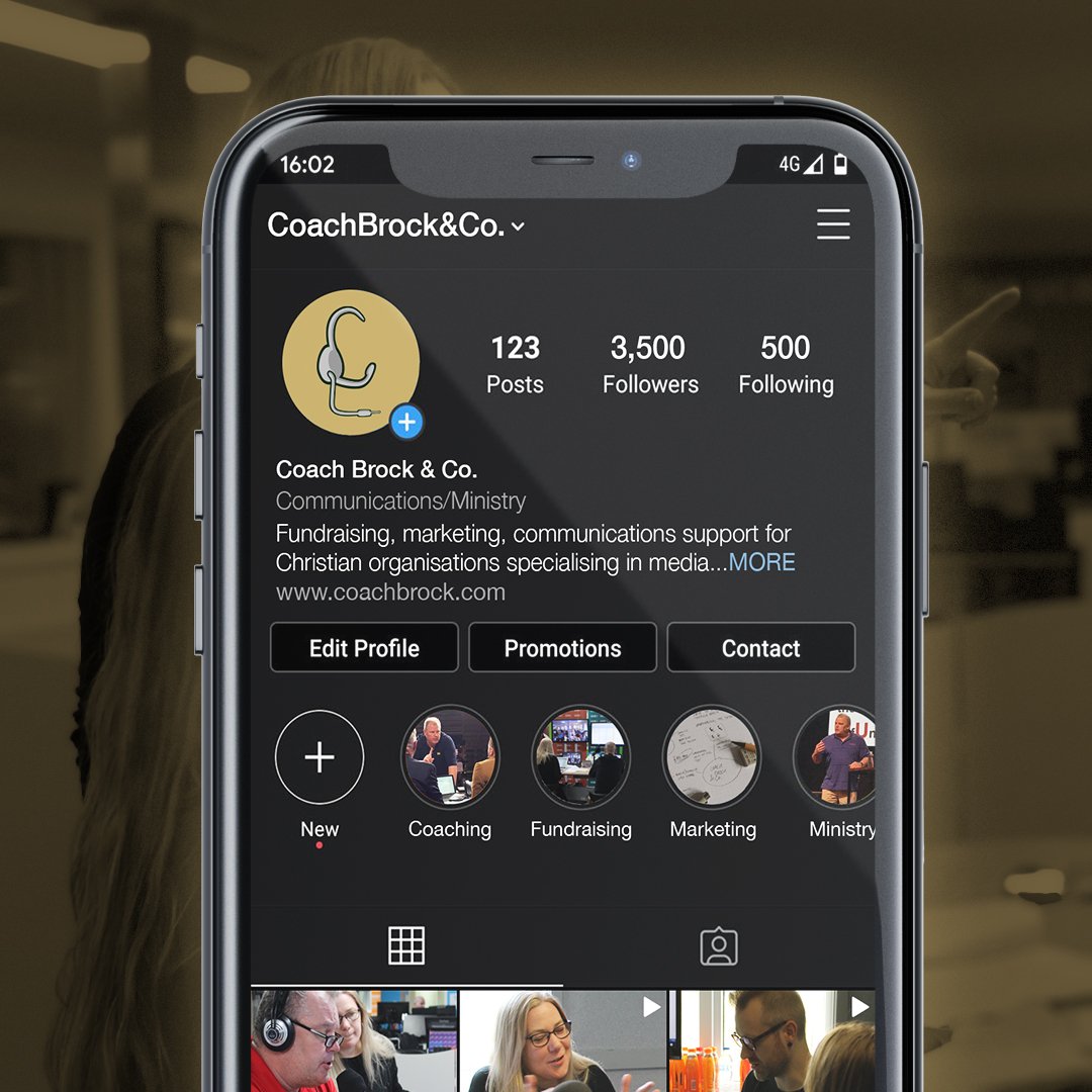
The sports coaching metaphor was a nice element to play with for this brand, allowing us to develop something that not only references the look of sports team branding, but is then able to work in a similar way, travelling across different media and even allowing us options to translate the brand in partnership with other organisations.
(Station names and colours used here for illustration purposes only).
